NYCWFF
New York City Wine and Food Festival Redesign
New york city wine and food festival
A Cultural Event Redesign project
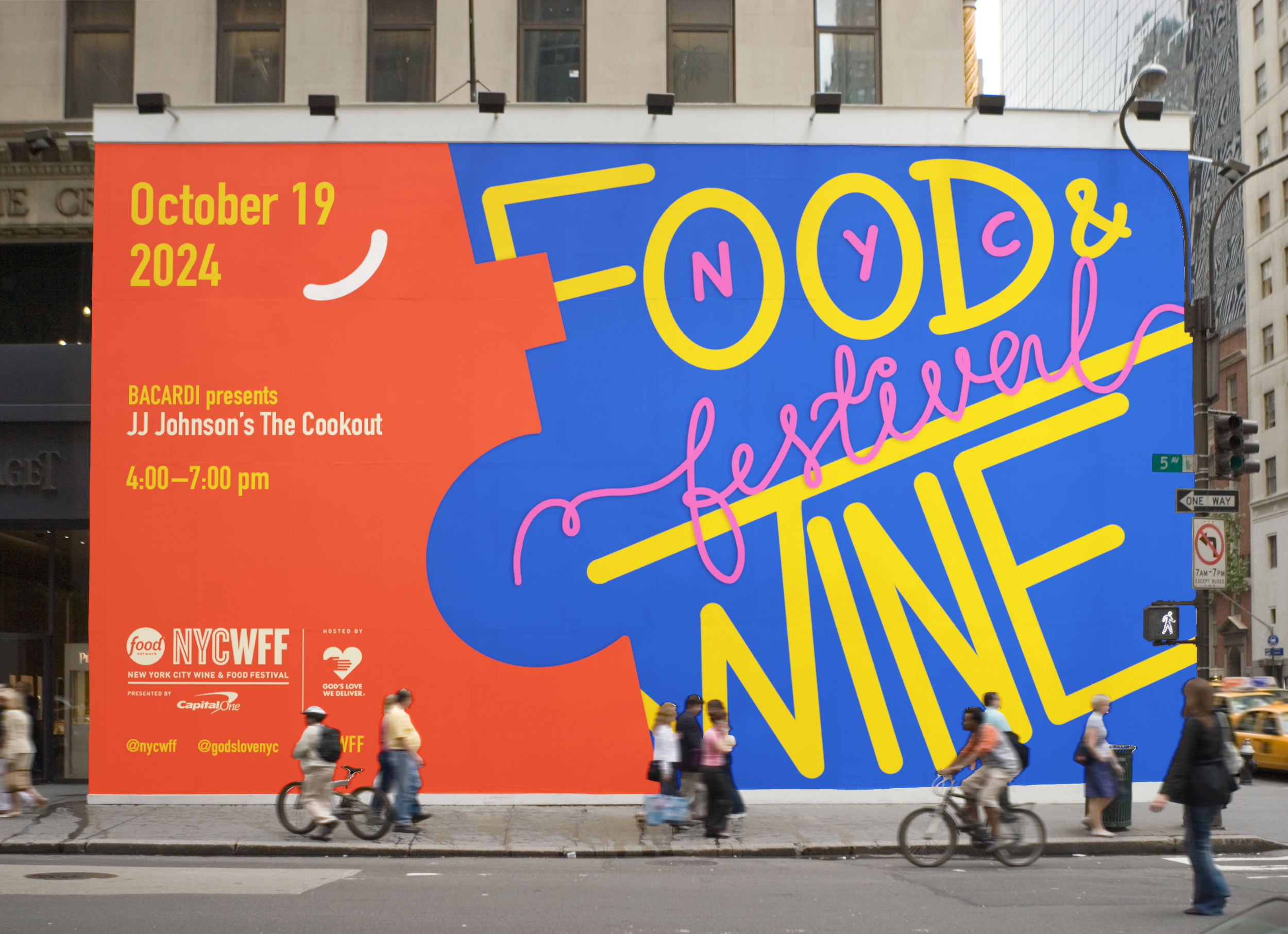
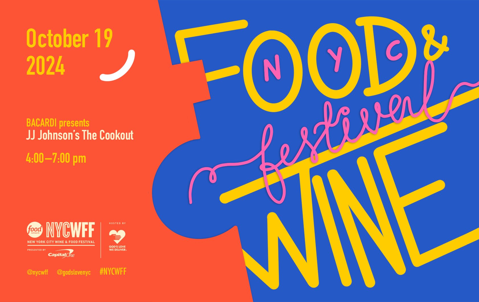
The idea was to redesign three outdoor brand systems for an event—a triptych. The goal was to create a connected system across the outdoor advertisements while retaining some individual characteristics of the platforms. The platforms were intended to be all part of the same brand system yet have some unique aspects that make one slightly different.
A Triptych means something composed or presented in three parts or sections.
This project was an exciting way of creating a system because the idea stemmed from another activity we did in class called collage mining. From there, I selected an event and redesigned the identity system based on research and experimentation.
Collage Mining
Collage Mining
Group Activity:
The in-class activity involved the entire class using various analogue mechanisms and materials to craft patterns and designs on paper. Everyone wrote their name on their sheet and started creating something seemingly random. After a minute, the paper would be passed down to the person sitting on the right, and this would continue moving along the class every minute until the paper was almost complete. We tore the paper, stuck things on it, scribbled and sketched and created a big collage.
Individual Activity:
After getting the collages back, we had to photograph visually interesting crops of the entire collage and collect 20 or so cropped images. For each image, we had to write down 15 words that described what we could see descriptively and thematically.
This was a great way to create an idea bank for current and future use.


Why this crop?
Out of all the crops I had proposed, the verdict was that this crop was the most visually interesting one and had a lot of potential to develop into an exciting exploration for this project.
Preparation
Preparation
Choice:
New York City Wine and Food Festival (NYCWFF)
Vibe Words:
Energetic, bubbly, exciting, inclusive, lively, heat, flavour, love, community, togetherness
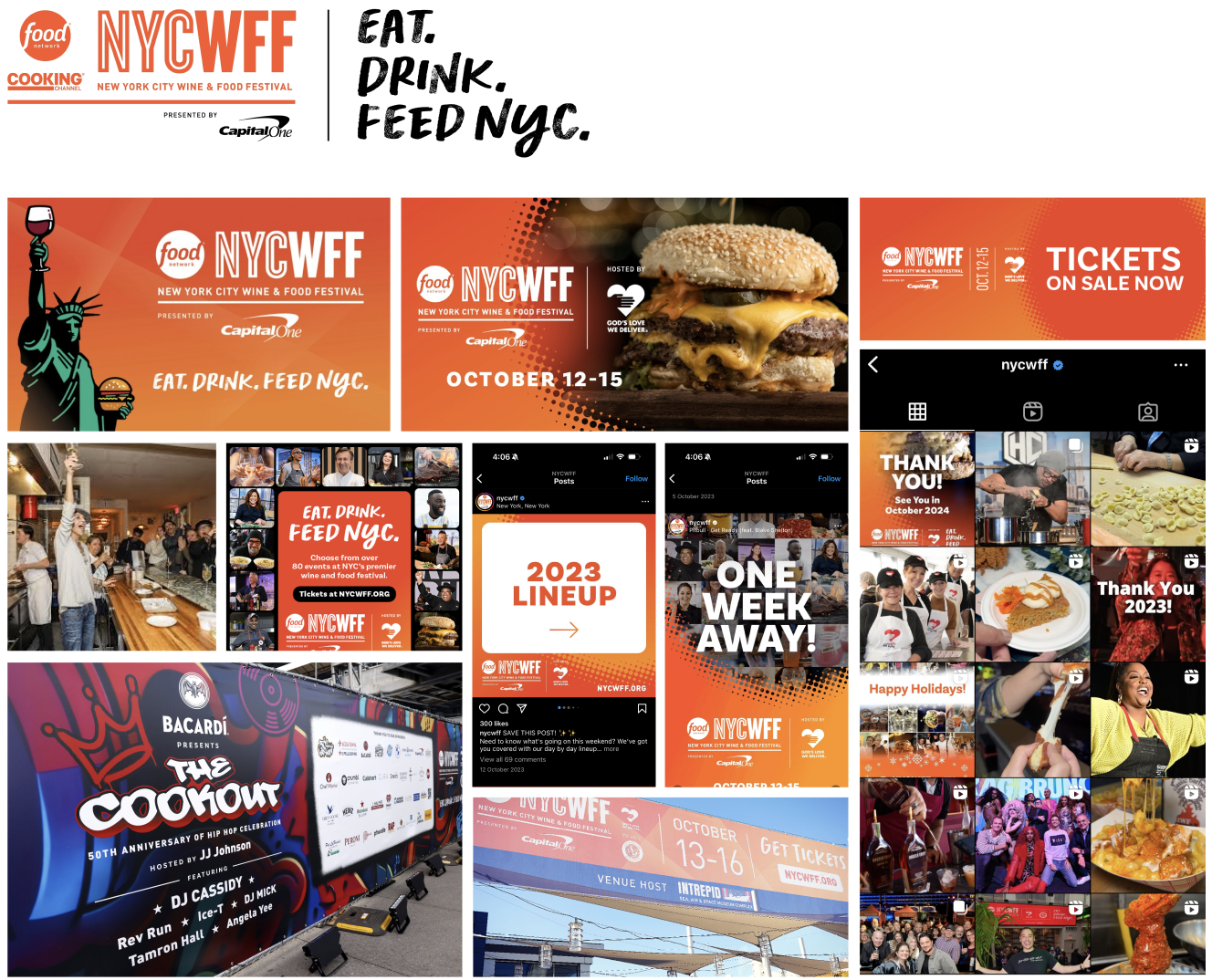
Current Design System:
Moodboards and Sketches
Moodboards and Sketches



Drafts
Drafts


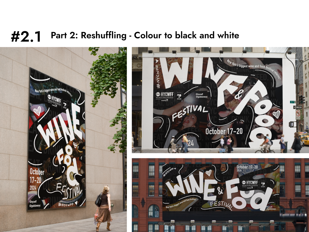


The Process
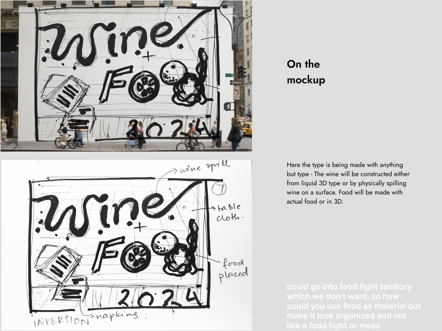
In the initial iterations - I decided to take a sketch and try to re-iterate it with the mood board. After that, I noted some consistencies and variations regarding other iterations I wanted to play around with.
Consistency:
Colour (uniform usage), Pattern (wave-line), Pattern (halftone), Lighting, Shadow (type only), Content
Variation:
Type (handwritten), Background image, Type (regular type), Composition, Orientation, Colour (multicoloured)
I also looked into how AI-generated images could be incorporated into the iterations and how the initial cropped image I used could be incorporated to create another design. Mixing things up gave me a lot of room to play with and come up with many different triptych ideas. Eventually, I decided to use the initial crop as the source and work on that concept for the triptych. I further edited that idea and polished the designs based on feedback and my mood board.
Final designs
Final designs


