Bioderma
An Identity System Redesign
Bioderma
Identity System Redesign - case study
Bioderma Laboratories is a privately owned French pharmaceutical company that specializes in medication for dermatological and hair/scalp conditions, as well as for Pediatric skincare and cell regeneration.
Bioderma is passionate about caring for, supporting, and improving each individual's quality of life. Their approach is “care first.”
Brand tagline: Ecobiology at the service of dermatology.
Design problem or challenge to solve:
Bioderma sells skin and hair care products from a dermatological perspective. The challenge was to make the brand look and feel more modernized, confident, sophisticated, trustworthy, and dependable. The brand has a lot to offer, but that is not visible.
Brand Archetype:
The Caregiver
The Caregiver Archetype’s instinct is to protect, support, and care for others. This innate drive can be seen in brands that emphasize compassionate service, devotion to customer needs, and the creation of trustworthy relationships. Understanding this archetype enables brands to position themselves better, allowing them to connect with customers more emotionally.
Gift: Helping you to care for others with benevolence, compassion and generosity.
Core Desire: Protect people from harm
Goal: To help others
Traits: Compassion, Caring, Reassuring, Nurturing, Warm
Fear: Selfishness, Ingratitude, Neglect, Instability, Helplessness
Brand Redesign
Brand Redesign


Petri Dish Symbolism:
The direction for the logo redesign was to show that Bioderma is a company keen on creating tangible, well-researched solutions to skin care. The subtle symbolism of overlapping two Petri dishes together denotes this and connects the idea of it being a global, caring, and scientifically backed brand.
Redesigned Logo:
The Bioderma logo redesign represents a more modern and stylized look for the brand. To make the overall look more refined and sophisticated, a custom letterform for the ‘B’ was created, and the typeface ‘Poiret One Regular’ was altered.
Brand Typography
Brand Typography

Brand Colours
Brand Colours

Noir:
#000000
Noir is classy, elegant, sophisticated and prominent in displaying the essence of the brand - minimal and robust, confident and stable. Noir is the glue that holds everything together.
Milk:
#FFFFFF
Milk provides what others cannot - balance of the elements and the personalities that the brand contains through its multitude of product classifications. Milk represents purity and elegance.
Cream:
#FCF9F5
A middle ground between two extremes, Cream provides the necessary cushion to the merging between the concepts of Ecology and Biology in Bioderma.

Brand Style
Brand Style

Impressionistic:
Bioderma is known for being a gentle and caring brand. Its backing from science has established its definitive mark on the market, where dermatological products are in high demand.
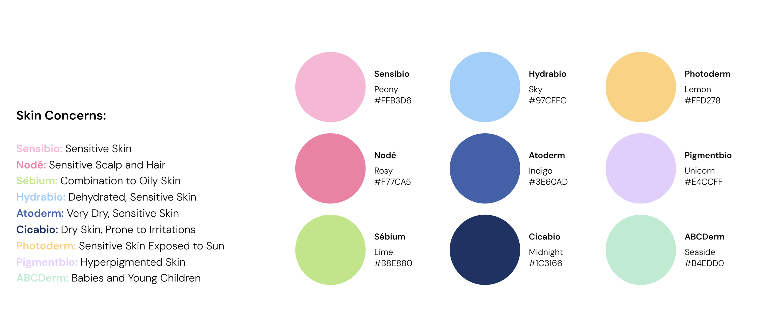
Their brand presence also needs to convey that idea. This is why the redesign is all about a more vibrant impression—subdued, subtle, and bright. It’s a blend of softer gradient tonality with vibrant hues, giving the brand a look that makes it approachable, trustworthy, and eye-catching.
Brand Packaging
Brand Packaging


Brand Website
Brand Website
Brand Instagram
Brand Instagram


Brand Indoor Promotions
Brand Indoor Promotions


Process
Process


